Best Type of Fonts To Use For Children’s Picture Books: 3 Things To Be Aware Of
Feb 17, 2025
Fonts can make or break a book. Obviously if your font is too small then your book will be hard to read and you’re bound to have some not so nice reviews. I'll talk more about that another time when I address font sizing, but today we’ll be focusing on what style of font you should have in your book.
When thinking about your book’s font, you need to keep in my 3 things.
- Who is your reader?
- Is it part of your art?
- Is it a Serif font or Sans Serif?
1. Who’s your reader?
The first thing we need to think about is who’s reading our book? Is it a child learning to read or is it a parent reading a sweet bedtime story?
If it’s a young child learning to read then we need to make sure our text is easy to read for them. Cursive font would NOT be a good choice for this type of reader.
Now on the other hand, if it was an adult reading it to their child, they could handle a little cursive writing (they may not like it that much depending on the parent, but they could read it).
2. Is it part of your art?
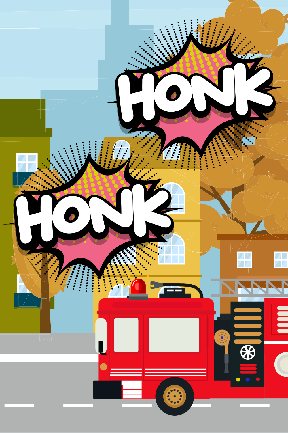
There are some books that use their font as part of their illustrations like the picture below.

And though it’s good for kids to recognize different ways to write letters, choosing to make your words part of the artwork in your book might not be ideal for an easy reader.
You need to try to match the reader’s skill with he purpose of the book. Is it meant to entertain or to teach them how to read?
Always keep that in mind when creating your book.
3. Is it a Serif font or Sans Serif?
The last thing we need to think about when thinking about the style of font we need to think about whether or not it is a serif font or sans serif.
Serif fonts have the little tail or line under the letter and sans serifs are made up of simple clean lines without the tails. Basically think tails or no tails lol

I find that serif fonts are more confusing for younger children because when they’re taught how to write they are taught to use straight clean lines.
Some letters are too fancy for young readers and they even wonder what letter they are looking at....this has happened to my son a few times!
If you plan to go the route of artistic font, then the typical font rules don’t necessarily need to be followed. Do what is best for your book. 😊
Which is Best?
Fonts can be hard to choose, but when you find the right one you will know.
Don’t stress too much about…have fun with and when you’re ready to self-publish your book and want me to walk you click by click on how to do it, then you can snag my Ultimate Self-Publishing course here…
Remember:
You are uniquely qualified to tell the story that is within you and the world needs what YOU ALONE have to offer! 💪💗🏅
Until Next Time,
Keep Scribbling!
Dawn Bowers
FREE Ultimate Story Guide Checklist
This free checklist will help to make sure you have all the right stuff in your story so don't have any gaps and you can write a story that is not just good but great!
We hate SPAM. We will never sell your information, for any reason.

